

Drawn to the Wild
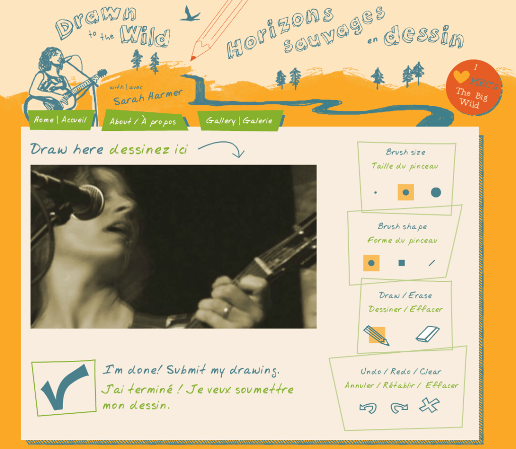
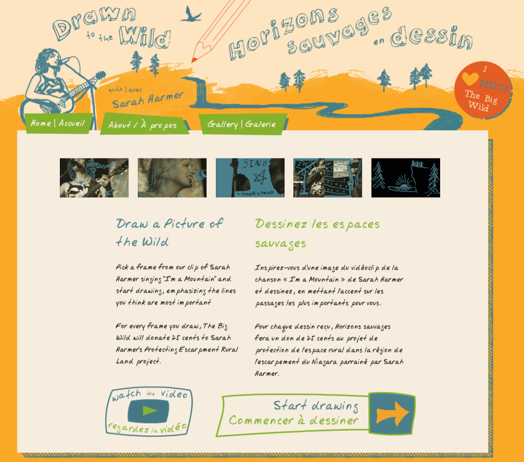
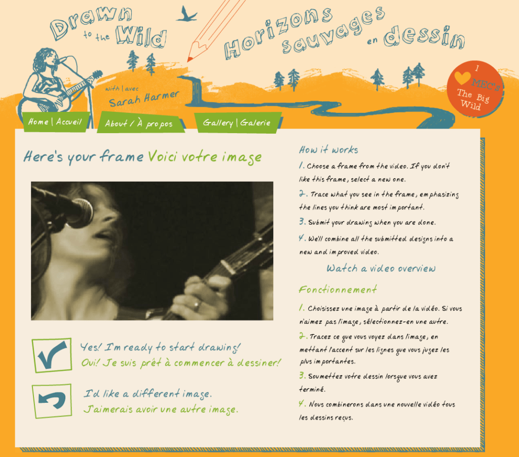
Custom interactive animation tool – an environmental fundraiser, this music video was built frame by frame with crowd-sourced creative.
Context
Environmental activism is a crowded playing field. The Big Wild is among hundreds of environmental organizations in Canada alone.
Organization
The Big Wild was founded in 2008 by the Canadian Parks and Wilderness Society and Mountain Equipment Co-op to build a community of people who want to celebrate and protect Canadian wilderness.
Challenge
The Big Wild is small. With only two full-time staff and limited resources, this wilderness conservation movement faces the challenge of having its messages heard amidst all the noise in today’s online environment. They came to us with a creative idea to build an engaging multimedia piece similar to thejohnnycashproject.com. But how could they implement that kind of functionality on a limited budget?
Solution
We put on our creative technology hats and worked with our mutual strengths. The Big Wild had already formed a relationship with Canadian singer-songwriter Sarah Harmer, who has dedicated parts of her work as an artist to conservation of the Niagara Escarpment. The Big Wild selected Harmer’s “I am a Mountain” song and video for the project, meanwhile we investigated technical and design solutions to implement it. The key was finding the right balance between complexity and simplicity; central to this was maintaining the integrity of the video, designing an engaging and fun interface for user participation, and creating an innovative project that was remarkable.
Impact
Darren Barefoot, the Big Wild’s project lead, provided some great information on the results of this campaign in this post on Beth Kanter’s blog:
In terms of measurement, here are some key facts about the project. The numbers are not huge, but are successful based on project scope and objectives. The Ôask’ was quite highÐtake the time to draw a frame of a videoÐwe really had no idea if we’d get 120 frames, let alone the 1200 we needed to complete the video, which was the primary goal.
Over the course of the project, we had about 11,000 visitors to the microsite.
They came from a variety of sources. Our top referrers included our own newsletter, Mountain Equipment Co-op’s (our parent organizationÐthink Canada’s REI) newsletter and blog, organic Facebook traffic, a small ad campaign on Facebook, Twitter and Reddit.
Not surprisingly, our Facebook advertising campaign had the highest conversion rate among those sources that sent significant traffic to the campaign. Unusually, traffic from Twitter was also above average. We wouldn’t typically expect to see that level of participation from a medium as ephemeral as Twitter. In this case, we think the fun, serendipitous nature of the project may have jibed with tweeters’ behavior.
To complete the video, we needed a minimum of 1200 frames. In all, we had 1822 frames drawn. We kept 1477 of them, and rejected 345. The rejects were mostly just poor efforts, with the rare downright rude drawing in the mix.
The average visitor drew about two framesÐwe had 851 unique contributors. Some people drew a lot more, though. We had two keeners who drew 56 and 54 frames respectively.
Overall, visitors spent an average of six-and-a-half minutes on the site.
We saw an uptick in new likes to The Big Wild’s Facebook page during the campaign.
What lessons can we draw from this project?
While it’s risky to present your community with a high-threshold act, they can come through for you. It helps if the activity is unique or fun. We were pleasantly surprised than nearly 8% of people who checked out the project decided to draw a frame.
Asking your supporters to do something time-consuming enables you to identify your more engaged membersÐthose who are highest on the engagement pyramid.
When devising an unorthodox campaign like this, it’s always a good idea to ask yourself “what does the web love”? Deriving inspiration from something that’s already succeeded on the web reduces your risk, and gives you a blueprint for success. We were always very careful to credit The Johnny Cash Project as inspiration for Drawn to the Wild on the microsite and in all our communications.
Set expectations appropriately. While we were optimistic that we’d get the 1200 frames we needed, we didn’t imagine that we’d get 20,000.
- Category: Campaigns, Creative Multimedia Campaigns, Environment and Social Justice, Unions and Associations
- ClientThe Big Wild
- Year2012
You can enable/disable right click
