Freshwater Scientists
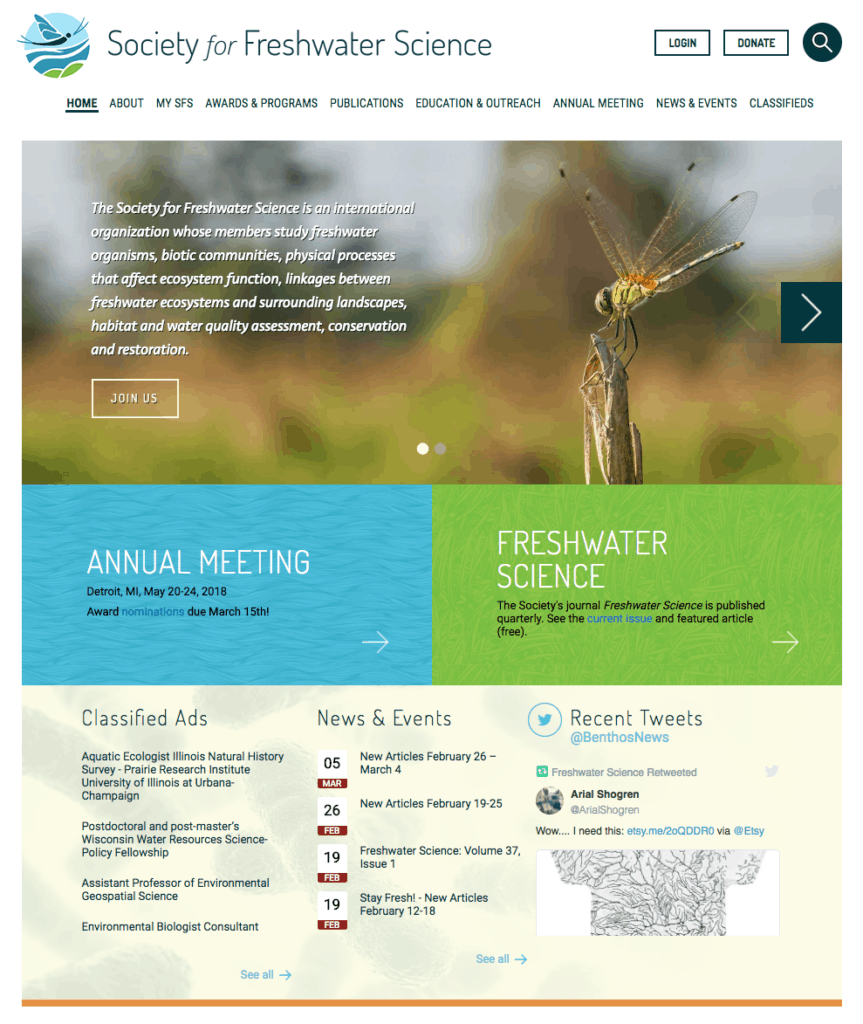
This project was a revamp of a website that badly needed an update. Plus, their identity hadn’t been changed since the 70’s. It was time to get to work.
We worked with a coalition of organizations to develop this project, including the identity. There were a lot of different options that had to be carefully sorted, including the society asking their general membership for input and design assistance for their logo. Luckily, in the end, it all worked out well, with a combination of member supplied art and our graphic design to develop the new identity. The website itself was tricky given the huge amount of content that needed to be addressed.
- Category: Environment and Social Justice
- Client:Society of Freshwater Scientists
- Year:2018
You can enable/disable right click
